5 Design Ideas That Never Get Old
There are some design ideas and concepts that never get old, no matter how many times you see them. Today, we’re exploring these timeless design ideas that you can incorporate into your own work.
These classic concepts are often deeply rooted in design theory. They might be trending styles that cycle in and out over time. They all incorporate elements that make a website design easy to look at, interact with, read and understand.
And for that reason, these design ideas never seem to get old. In fact, you can call them timeless design styles.
The Ultimate Designer Toolkit: 2 Million+ Assets
Envato Elements gives you unlimited access to 2 million+ pro design resources, themes, templates, photos, graphics and more. Everything you'll ever need in your design resource toolkit.


1. Great Grids
It’s hard to beat a good grid.
Use it vertically or horizontally – or both – to create organization and visual flow. Grids are great when you have a lot of content or just can’t quite wrap your head around making photos and other elements work together.
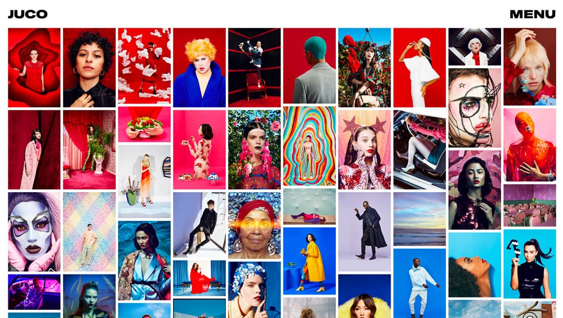
Even with more rigid grids, the design can be creative and interesting. JUCO, above, uses a fun color theme within the grid to draw the eye across the screen. Even with a distinct flow vertically and a nice pattern horizontally, there’s nothing plain or boring about this use of the grid. Sadly, that’s the most common objection from designers that don’t want to use one.
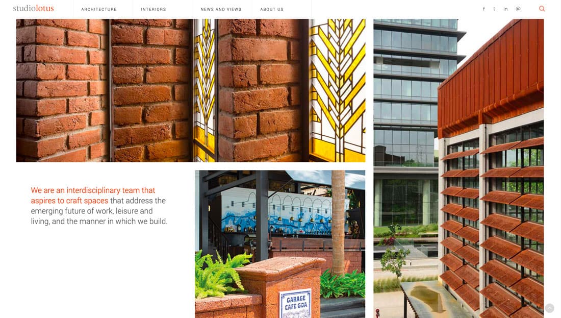
The best thing about a good grid is that it is versatile and can even be invisible to many users. Note the grid for Studio Lotus, above. Photos and text elements fall into place in an orderly fashion without everything having a uniform look.
2. Black and White
No matter what’s trending in color, black and white is classic and always in style.
The contrasting color palette sets a certain tone for projects and works with almost any content and style. Add accenting color for a special something to draw users in even more.
The great thing about black and white is that it can work for user interface elements, backgrounds and foregrounds, and photos and video. Plus, black and white color schemes don’t overpower other effects such as animation or sound.
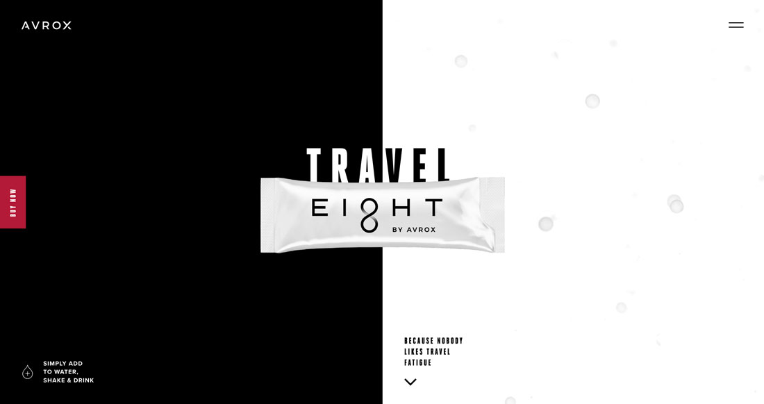
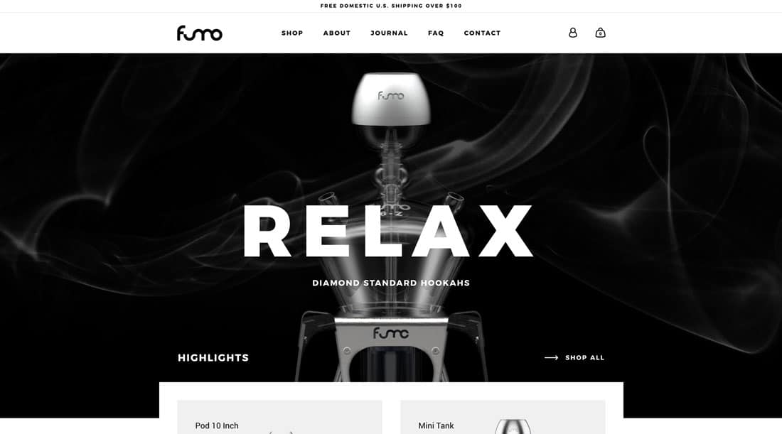
Avrox and Fumo Design, above, use black and white aesthetics, but look completely different. That’s the beauty of this design concept, and why it never gets old.
3. Split Screens
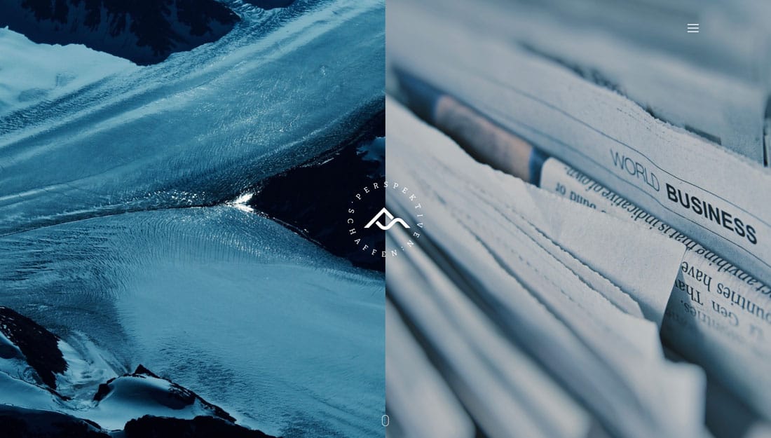
Split-screen design started as a website trend a few years ago and with every new dual-panel project, it seems to get better. This design concept has cemented itself as a new classic.
Split screen design provides an optimal way to communicate a this-or-that idea without having too much on the screen. Whether the split is purely visual or more functional is up to the designer.
But all of these projects often come with a distinct function benefit: Split screens stack neatly vertically, so the design converts to mobile with ease and no loss of content.
4. Plenty of White Space
Repeat after me: White space is your friend.
Despite trends in minimalism, there are still plenty of designs that just seem overstuffed with content elements. Don’t fall into that trap.
White space can open up a design and make it more digestible and easier on the eyes. Open space can make elements feel larger, more organized and easier to read. Space creates organization and makes everything on the canvas feel like it has a distinct purpose.
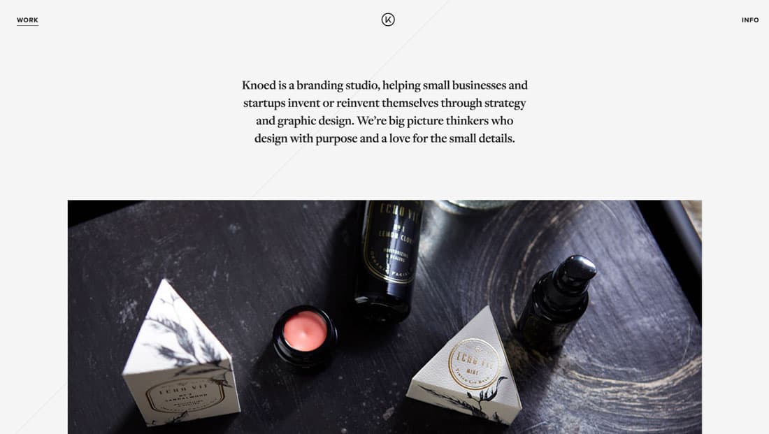
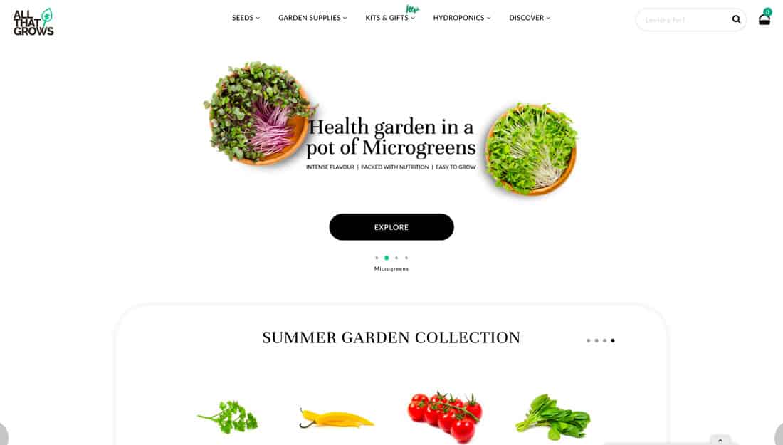
Using plenty of white space does not mean you have to move to a minimal outline. Think about the amount of space between elements, such as the header for All That Grows, above, or around key text elements, such as Knoed Creative.
Space at the edge of the screen can be helpful visually and in terms of interaction. That extra space to the left and right of the screen can provide just enough room for users to scroll on mobile devices without accidentally tapping other elements. (This is a big deal in terms of preventing user frustration and easy to build into the design.)
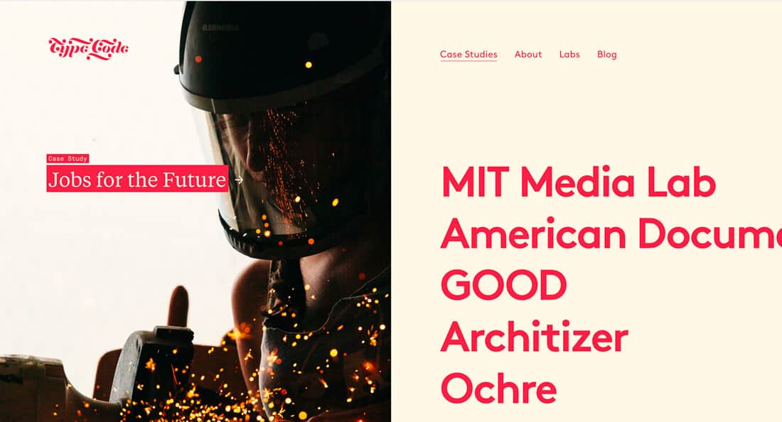
5. Oversized Typography
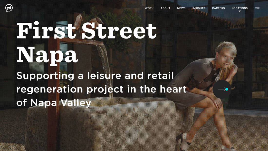
The days of tiny, hard to read text are gone. Most users are reading on smaller screens, making larger text a necessity.
Oversized typography is a great design solution. Huge lettering gets an opening message to users quickly. Use it without overwhelming users by limiting the number of words and with a highly readable typeface.
Big letters can work inside a hero image, on a plain background and even for body copy. (Consider using 18-point text here rather than 12 or 14.)
The thing to remember when it comes to oversized typography is to consider oversized spacing as well. Linespacing should be appropriate to the text size for ease of reading and to keep the eyes from getting stressed.
While both examples above use oversized text differently (and at very different weights), it’s easy to see how large lettering can establish a tone, create an easier typographic hierarchy and contribute to overall readability.
Conclusion
The common theme among all of these designs is that they are readable and engaging. Not only do they use specific and classic techniques, but they also incorporate design elements into a cohesive project that’s visually appealing.